How to Use Multiple Timeframes for Better Trade Entries
In trading, context is everything. Taking a trade based on a single chart is like trying to navigate a city using only a street-level photo—you see what’s directly in front of you, but have no idea if you’re heading toward your destination or a dead end. This is where multiple timeframe analysis becomes a non-negotiable skill. By analyzing the same asset across different time horizons, you gain a layered perspective that filters out market noise and meaningfully increases the probability of your setups. It’s the difference between guessing and making an informed decision.
What Is Multiple Timeframe Analysis?
Multiple Timeframe Analysis (MTA) is the process of viewing the same asset through different time compressions. Instead of just looking at a 15-minute chart, you simultaneously analyze the 4-hour and daily charts to understand the full market story. This top-down approach gives your short-term actions long-term context.
The Core Concept: Seeing the Forest AND the Trees
Think of it like a map. The weekly chart is the entire country, showing you the primary direction of travel. The daily chart is the city you’re in, revealing the major highways and districts. The hourly chart is the specific street you’re on, guiding your immediate turns.
Without the country-level view, you might take a “shortcut” on a city street that leads you directly away from your final destination. In trading, this means taking a buy signal on the 5-minute chart right as the daily chart is screaming “downtrend.” MTA forces you to respect the forest (the long-term trend) before you get lost analyzing the trees (short-term price action).
Why It Matters in Fast-Moving Markets
Modern markets are heavily algorithmic. High-frequency trading, automated liquidity provision, and rapid sentiment shifts can create violent, misleading price swings on lower timeframes. A sudden spike on the 15-minute chart might look like a breakout, but MTA often reveals it’s just noise within a broader consolidation pattern on the 4-hour chart.
By requiring a signal on a lower timeframe to align with the dominant trend on a higher timeframe, you automatically filter out a large number of low-probability trades. You stop fighting the current and start trading with the tide. This is exactly how entries in the SimpleMarkets strategy library are specified — each defines a trading timeframe plus a higher-timeframe trend filter, with the backtest evidence attached.
The Top-Down Framework: Choosing and Using Your Timeframes
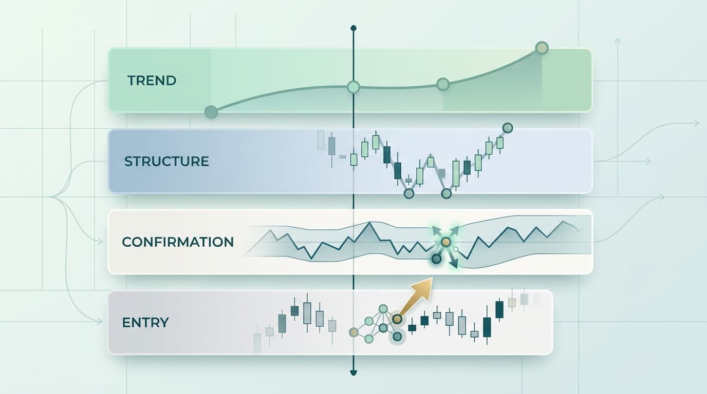
The most common and effective way to implement MTA is with a three-chart system. This provides enough context without leading to information overload. The key is to assign a specific role to each timeframe and stick to it.
Anchor, Setup, and Entry Timeframes
Your three charts should be separated by a factor of about four to six. This provides a distinct enough view at each level. The roles are:
Anchor Timeframe (Highest): This is your forest. Its only job is to tell you the primary trend direction. Bullish, bearish, or ranging? You only look for trades that align with this chart.
Setup Timeframe (Middle): This is your city map. Here you identify specific trading opportunities within the primary trend—pullbacks to support in an uptrend, rallies to resistance in a downtrend.
Entry Timeframe (Lowest): This is your street view. You use this chart to pinpoint your exact entry and exit points. After identifying a pullback on your setup chart, you zoom in here to find the precise candlestick pattern or indicator signal to trigger your trade.
Defining a Role for Each Chart
The specific timeframes you choose depend entirely on your trading style. Two common examples:
Trader Type | Anchor | Setup | Entry |
|---|---|---|---|
Swing Trader | Weekly | Daily | 4-Hour |
Day Trader | Daily | 1-Hour | 15-Minute |
A swing trader would first check the weekly chart. If it shows a clear uptrend, they move to the daily chart to find a pullback to a key support level (like the 50-day moving average). Finally, they zoom into the 4-hour chart and wait for a bullish engulfing candle or an RSI moving out of oversold territory to enter the trade. The rule is simple but powerful: if the anchor chart is bearish, you do not look for long trades on the lower timeframes. Period.
Timeframe Alignment: Where the Real Edge Lives
Once the three-chart framework feels natural, the next concept to internalize is alignment. Your highest-probability trades occur when all three timeframes point in the same direction at the moment you pull the trigger—the anchor is trending up, the setup chart is bouncing from a higher low, and the entry chart is breaking out of a small consolidation. Three green lights.
When the entry timeframe diverges from the setup timeframe, the trade isn’t automatically invalid—but it is lower probability. Maybe the setup chart shows a clean pullback to support, but the entry chart still looks weak and hasn’t produced a reversal signal yet. That’s a wait, not a trade. The mistake beginners make is treating “two out of three” as “close enough.” It’s not. The full edge of MTA comes from patience: waiting until your entry chart confirms what the higher charts are already telling you.
A useful filter: before entering, articulate out loud what each chart is telling you. If you can say “the daily is up, the 1-hour just bounced from support, and the 15-minute is breaking the recent swing high,” you have alignment. If you find yourself rationalizing—“well, the daily looks kind of okay”—you don’t.
A Practical Walkthrough: Finding a Trade in ETH
Let’s walk through a hypothetical day-trading setup for Ethereum (ETH) using the Daily/1-Hour/15-Minute framework. The principles apply equally to stocks, forex, or any other liquid market.
Step 1: Identify the Primary Trend (Daily Chart)
First, we open our anchor chart: ETH/USD Daily. Goal: determine the dominant trend. We aren’t looking for an entry; we’re just checking the market’s direction.
Suppose the price is consistently trading above its 50-period Exponential Moving Average (EMA), the 50 EMA is sloped upwards, and the market has been making a series of higher highs and higher lows for several weeks.
Conclusion: The primary trend is bullish. Our bias for the day is to only look for buying opportunities. We ignore all short-selling signals on the lower timeframes.
Step 2: Pinpoint the Setup and Entry (1-Hour and 15-Minute)
Next, we move to our setup chart: the 1-Hour. With our bullish bias established, we’re looking for a price pullback to an area of potential support. ETH has pulled back to a previous resistance level that should now act as support, and price is starting to stall in this area. This is our area of interest—not yet a trade.
Finally, we zoom into our entry chart: the 15-Minute. We watch the price action closely as it interacts with our support level. We’re not buying just because price hit the level—we need a trigger. We see the price form a double bottom pattern accompanied by bullish divergence on the Relative Strength Index (RSI): price made a lower low, but RSI made a higher low. This signals that bearish momentum is fading. The break of the double bottom’s neckline is our trigger to enter a long position.
By layering the timeframes, we entered a high-probability trade: a short-term buy signal at a key support level during a pullback within a dominant daily uptrend. Three timeframes, three confirmations.
A Note on Tooling
Executing this workflow smoothly depends on being able to see all three charts at once. TradingView is the default choice for most retail traders—the free tier supports one chart per layout, the Plus plan (around $15/month) supports two, and Premium (around $60/month) gets you eight charts on a single layout. If you trade equities through Schwab, ThinkorSwim handles multi-chart layouts natively at no extra cost. Multi-monitor setups are another route, though more cumbersome to maintain. SimpleMarkets.io takes a different angle: a unified dashboard across crypto, equities, forex, and prediction markets, which matters more if you trade across asset classes than if you live entirely in one. It’s newer than TradingView and lacks some of the deep charting features power users expect, but the cross-asset view is the trade-off.
Common Mistakes to Avoid
MTA is a powerful filter, but it’s easy to misuse. These are the traps that negate its benefits.
Analysis Paralysis: Using Too Many Charts
If three timeframes are good, five must be better, right? Wrong. Adding the 4-hour, 30-minute, and 5-minute charts to the mix will inevitably give you conflicting signals—the daily is bullish, the 4-hour is bearish, the 1-hour is bullish, the 15-minute is ranging. You’re so overwhelmed with conflicting data you can’t make a decision. Stick to three timeframes. The goal is clarity, not complexity.
Ignoring the Higher Timeframe Signal
This is the most critical mistake a trader can make with MTA. The entire purpose of the framework is to use the higher timeframe as your ultimate guide. If the daily chart is in a strong downtrend but you find a “perfect” long setup on the 15-minute, you must ignore it. Forcing a trade against the primary trend is like trying to swim up a waterfall—you might make a little progress, but the dominant force is working against you. The highest timeframe is the boss. Its opinion isn’t a suggestion; it’s a rule.
Recalibrating Indicators on Every Chart
Some traders, when they move from a daily to a 1-hour chart, immediately start tweaking their RSI or moving average periods to “fit” the new timeframe. Don’t. The whole point of MTA is that each timeframe’s indicator is reading the price action of that timeframe—a 14-period RSI on a daily chart and a 14-period RSI on a 15-minute chart are telling you different things, and that’s the feature, not a bug. Keep your settings consistent across charts; let the timeframe do the work of changing the context.
Treating MTA as a Win Guarantee
Multiple timeframe analysis improves probability. It does not guarantee outcomes. Aligned trades still lose. The framework reduces the rate at which you take low-quality setups; it doesn’t eliminate losers. Sizing, stop placement, and risk management still matter just as much as they did before you adopted MTA.
FAQ
What are the best timeframes to use for day trading?
A popular and effective combination is the Daily, 1-Hour, and 15-Minute (or 5-Minute) charts. The Daily establishes the main trend and key support/resistance levels. The 1-Hour helps identify intraday trends and setups like pullbacks or consolidations. The 15-minute or 5-minute is used to time your exact entry, waiting for a specific trigger such as a candlestick pattern or indicator confirmation. This structure ensures your intraday trades align with broader momentum.
How do you combine indicators across multiple timeframes?
Assign roles, and keep settings consistent across charts. Use a trend-following indicator like a 50-period or 200-period EMA on your highest timeframe to define the overall trend. Use an oscillator like RSI or Stochastic on your middle and lower timeframes to identify overbought or oversold conditions during pullbacks. Critically, use the same period settings (e.g., 14-period RSI) on every chart—the timeframe itself changes what the indicator measures, so recalibrating defeats the purpose.
Can I use MTA for any asset class?
Yes. The principles of MTA are universal because they’re based on market structure and crowd psychology, both of which are present in all traded markets. Whether you’re analyzing Bitcoin, Tesla (TSLA), or EUR/USD, the top-down approach of identifying the primary trend and seeking entries on lower timeframes works the same way. The main caveat is liquidity: in thinly traded markets, lower-timeframe charts can be too noisy for clean signals, and you may need to use the next timeframe up.
Is top-down analysis always better than a bottom-up approach?
For most retail traders, especially trend-followers and swing traders, top-down analysis (starting from a high timeframe and moving down) is significantly more reliable. It ensures you’re trading with the dominant market flow. A bottom-up approach—spotting something on a 1-minute chart and then checking higher timeframes for confirmation—is typically used by short-term scalpers. It’s a riskier method because it can easily lead you to trade against a powerful, unseen trend.
How can I view multiple timeframes at once?
There are a few practical options. Multi-monitor setups are the old standby—reliable but expensive and physically cumbersome. TradingView offers multi-chart layouts on its paid tiers (Plus around $15/month for two charts, Premium around $60/month for up to eight in a single layout); the free tier limits you to one chart per layout. ThinkorSwim, free with a Schwab account, supports multi-chart workspaces natively and is a strong choice if you trade equities and futures. Some brokers’ native platforms (like Interactive Brokers’ TWS) also support custom multi-chart layouts. Pick the one that matches what you trade and how much charting depth you need.
If you trade across crypto, equities, and forex and want a single dashboard with multi-chart layouts built in, SimpleMarkets is built for that workflow. If you live entirely inside one asset class, a specialist tool like TradingView or ThinkorSwim will likely give you more depth.