How to Read a Candlestick Chart: A Simple Guide for New Traders
How to Read a Candlestick Chart: A Simple Guide for New Traders
Whether you're looking at Bitcoin, Tesla stock, or the EUR/USD pair, you'll encounter the same visual language: candlestick charts. They can look like a confusing wall of red and green blocks at first, but the underlying logic is straightforward. This guide breaks down the anatomy of a candle, five patterns worth knowing, and the contextual factors that separate useful signals from noise.
The Anatomy of a Candlestick: Body, Wicks, and Colors
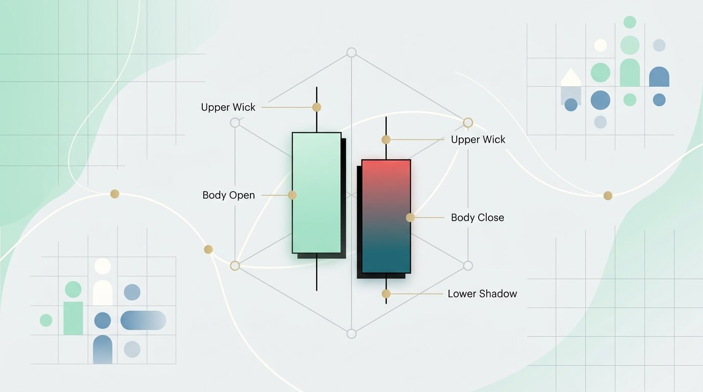
Every candlestick represents the battle between buyers (bulls) and sellers (bears) over a specific time period. It packs four data points into one shape: the open, high, low, and close (OHLC).
The Body
The thick, rectangular part of the candlestick is the body. It shows the range between the opening price and the closing price for that period. On a daily chart, the body represents the price movement from market open to market close.
A long body means strong momentum—significant movement from open to close. A short or nearly invisible body (like the Doji pattern covered below) signals indecision, where buyers and sellers essentially fought to a draw.
The Wicks (or Shadows)
The thin lines extending above and below the body are called wicks or shadows. They mark the price extremes during the period:
Upper wick: The top marks the highest price reached.
Lower wick: The bottom marks the lowest price reached.
Long wicks tell you something important. A long upper wick on a green candle means buyers pushed the price up aggressively, but sellers pushed it back down before the period closed—a sign that bullish momentum may be weakening. A long lower wick is the mirror: sellers drove the price down, but buyers recovered it, suggesting buying support at that level.
Green vs. Red
Green (bullish): The close was higher than the open. Buyers won. The bottom of the body is the open; the top is the close.
Red (bearish): The close was lower than the open. Sellers won. The top of the body is the open; the bottom is the close.
Combine body size, wick length, and color, and you can read the price action of any asset in any timeframe at a glance.
5 Candlestick Patterns Worth Knowing
Individual candles are useful. Patterns—combinations of candles in sequence—are more powerful. There are hundreds of named patterns, but most traders get the bulk of their value from a handful. These patterns are universal: they appear on crypto, stock, and forex charts alike because they reflect the same underlying psychology of fear, greed, and indecision.
1. Bullish & Bearish Engulfing
This is a two-candle reversal pattern.
Bullish Engulfing: At the end of a downtrend, a small red candle is followed by a large green candle whose body completely "engulfs" the previous one. The interpretation: buyers have overwhelmed sellers, and the trend may reverse upward.
Bearish Engulfing: The inverse. At the end of an uptrend, a small green candle is followed by a large red candle that engulfs it. Sellers have taken control.
Engulfing patterns are a good starting point for beginners because they're visually obvious and the logic is intuitive—one side's momentum completely overtakes the other.
2. The Hammer
A single-candle reversal pattern: short body, long lower wick (at least twice the body's length), little or no upper wick. It appears after a decline and signals that sellers drove the price down but buyers fought it back near the open—a potential bottom.
3. The Hanging Man
Visually identical to the Hammer, but it appears after a price advance. Same shape, opposite implication. A long lower wick during an uptrend means selling pressure showed up meaningfully for the first time—a warning sign that the trend may be losing steam.
4. Doji
A candle with a tiny or nonexistent body—the open and close were virtually the same. It looks like a cross or plus sign. A Doji represents a moment of equilibrium: neither side won.
On its own, a Doji is neutral. But context changes everything. A Doji after a long run of green candles can signal that buying momentum is fading. After a string of red candles, it might mean selling pressure is exhausted. In both cases, wait for the next candle to confirm which way the market breaks.
5. Morning Star & Evening Star
Three-candle reversal patterns that are particularly reliable on daily and weekly charts.
Morning Star (bullish): A long red candle, followed by a small-bodied candle (often a Doji) that gaps down, followed by a long green candle that closes well into the first candle's body. It marks a transition from selling pressure to buying pressure.
Evening Star (bearish): The inverse. A long green candle, a small-bodied candle that gaps up, and a long red candle closing well into the first candle. It signals a potential top.
Context Is Everything: Timeframes and Volume
Spotting patterns is only half the job. A Bullish Engulfing pattern can be a strong signal or meaningless noise depending on two things: the timeframe you're looking at and the volume behind the move.
Choosing the Right Timeframe
A candlestick chart can represent any timeframe—one minute, one hour, one day, one month. The timeframe you choose should match how you trade:
1-minute to 15-minute charts: Day traders and scalpers use these for quick trades. Patterns appear constantly but are less reliable because each candle represents a tiny slice of market activity.
1-hour to 4-hour charts: Swing traders typically live here, holding positions for hours to days and looking to capture "swings" within a larger trend.
Daily, weekly, and monthly charts: Position traders and longer-term investors use these. A pattern on a daily or weekly chart carries significantly more weight than the same pattern on a 5-minute chart, simply because more market participants and more capital are reflected in each candle.
A practical habit: if you spot a pattern on a shorter timeframe, zoom out to a longer one and check whether it aligns with the broader trend. A bullish signal on the 1-hour chart is more convincing when the daily chart is also trending up.
Why Volume Matters
Volume is the number of shares, contracts, or coins traded during a period. It measures conviction.
A candlestick pattern on high volume is far more meaningful than the same pattern on low volume. If you see a Bullish Engulfing at the bottom of a downtrend on a big volume spike, it tells you a large number of participants jumped in—that's real demand. The same pattern on thin volume could just be noise.
Most charting platforms (TradingView, SimpleMarkets.io, thinkorswim, etc.) let you overlay a volume histogram at the bottom of the chart. Make it part of your routine: spot the pattern, then check the volume.
Common Mistakes New Traders Make with Candlestick Charts
Knowing what to look for is important. So is knowing where beginners typically go wrong.
Trading patterns in isolation. A Hammer is a hint, not a command. Patterns are probabilistic signals, not guarantees. The best traders combine candlestick analysis with other tools—support/resistance levels, moving averages, trend lines—and always use stop-loss orders to limit downside.
Ignoring the trend. A bullish pattern in the middle of a strong downtrend is far less reliable than the same pattern at a well-established support level. Always ask: does this pattern make sense given the larger trend and nearby price levels?
Over-relying on short timeframes. Patterns on 1-minute or 5-minute charts produce a lot of false signals. If you're just starting out, focus on 4-hour and daily charts where patterns have more weight.
Skipping volume confirmation. As covered above, a pattern without volume confirmation is weaker. This is the single most common step beginners skip.
Getting Started
If you're new to this, the best approach is simple: open a chart, pick one asset, set the timeframe to daily, and just start looking. Try to identify the patterns described above. Don't trade them yet—just practice reading what happened and checking whether the pattern played out. SimpleMarkets' live charts work well for this — pull up any asset and scroll back.
Most major platforms offer this capability. TradingView is the most widely used charting tool and has a generous free tier. TrendSpider offers automated pattern detection if you want to accelerate the learning process. If you trade across multiple asset classes—crypto, stocks, and forex—a unified dashboard like SimpleMarkets.io lets you apply the same analysis across all of them without switching between apps, though it comes at a higher price point ($50–200/mo) and is still building out some features that specialized platforms already have (like a mobile app).
The tool matters less than the habit. Candlestick reading is a skill that improves with repetition, and the patterns are the same everywhere.
FAQ
What's the most important candlestick pattern for beginners?
Start with the Engulfing pattern (both bullish and bearish). It's a two-candle pattern with clear, intuitive logic—one side's momentum completely overtakes the other. It's easy to spot, appears frequently across all markets and timeframes, and provides a strong visual signal of potential reversal.
How long does it take to learn to read candlestick charts?
The basics—candle anatomy and a handful of key patterns—take a few hours. Reading charts intuitively and making real decisions from them takes a few months of consistent daily practice. The goal isn't to memorize patterns but to understand the market psychology behind them and develop the habit of checking context (volume, timeframe, trend) before acting.
Do candlestick patterns work for crypto and forex?
Yes. Candlestick patterns reflect human behavior—fear, greed, indecision—which drives price action in any freely traded market. A Bullish Engulfing on a BTC/USD chart signals the same shift in momentum as it does on EUR/USD or Apple stock. That universality is what makes candlestick analysis worth learning.
Do candlestick patterns guarantee a profit?
No. Patterns are tools for assessing probabilities, not certainties. False signals are a normal and expected part of trading. That's why experienced traders combine candlestick analysis with other indicators and always use risk management (stop-loss orders, position sizing) to protect their capital. No single pattern should be the sole basis for a trade.
When you're ready to go beyond patterns, the strategy library shows which systematic setups actually survived backtesting — evidence included.